Hotstar vs Netflix: Are things in order?

“Umm. There’s a bit of ‘Learning Curve’ there”.

These words, when used by a client, really mean “We expect the users to get used to the way we have designed our product”.

But lets face it. Nobody likes going back to school. Users (all of us, really) are fundamentally lazy. They expect learning curves to be less steep, rather completely absent, when they use any app for the first time.

There are two types of apps based on the way user interacts with them.

1] Lean Forward apps – Where user is supposed to actively take part in the function of the application such as typing out a post on Facebook, or killing pigs in Angry Birds.

2] Lean Backward Apps – Where user is a passive recipient of the content the app brings along, occasionally taking active part such as playing videos on Youtube, listening to music  or a podcast.

Both Netflix and Hotstar are, essentially, Lean Backwards apps. They are entertainment apps that demand very few user actions. But in case of Hotstar, even when demanding those few actions, some conflicting signals are being given out.

This is essentially a case of not handling user expectations well.

Every user’s expectations are formed by the users interaction history. If I used Gmail before using any other email app, I will expect every single email app to be just like it. Microsoft Outlook would baffle me at start. And the same would hold true with Gmail if I used Outlook first.

Now it is impossible to know what path each user has taken to arrive at your app, some amount of study of common interaction patterns can give you cues about how your app should be structured.

Following is a personal experience with Hotstar App on Apple TV. My interaction history had Netflix experience in the same genre of apps on Apple TV. See how a simple ordering difference confused me as a user.

The first episodic show that I saw on Hotstar was John Oliver’s ‘Last Week Tonight’. Here is how the show’s landing screen has the episodes ordered.

hs-04

This screen told me that all episodes are chronologically arranged from right to left. This did go against the way I read (I am from an english speaking country and even my local script is read from left to right) But I imagined that this makes it easier to find the latest episode on this screen, which will be on the extreme left. At the click of the play button, I shall see Episode 30. Got it.

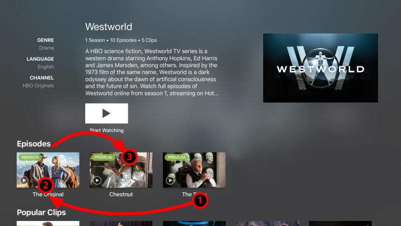
The next show I saw was Westworld. And the screen looked like this.

screen-shot-2016-12-22-at-11-09-59-am-a

Having gone through ‘Last Week Tonight’, I assumed that even these episodes were ordered the same way. Well, I ended up watching the third episode first and after five minutes of sheer confusion checked back again! The date scroll informed me that the first one was called ‘The Original’ which was on the extreme left. How odd!

screen-shot-2016-12-22-at-11-09-59-am-b

I made a mental note to myself to watch all fiction shows this way if I was on Hotstar. The next Show was ‘Game of Thrones’ and I knew exactly how to watch it.

hs-03

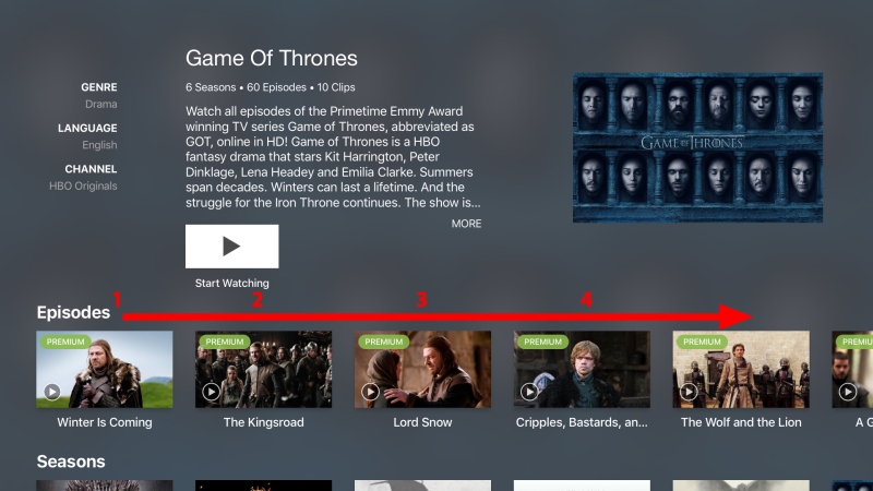
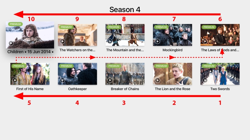
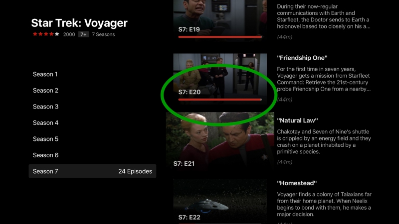
But the trouble started when I got inside one of the old seasons. And here, to my surprise, was a completely different order!

hs-10

But if you watch the season on the website the order is different. Rather, the order is quite right, as my prior experience of reading English has taught me! Take a look:

hs-06

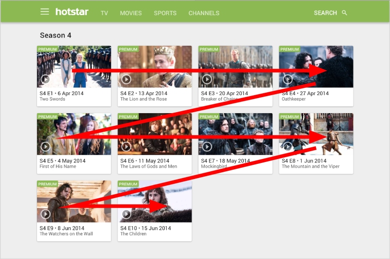
It also had release date and episode number mentioned under each thumbnail, making it easy for me to understand the order.

On Apple TV app, there might be technical constraints that make it impossible for them to display this useful information. upon selecting a particular thumbnail, however, the title text scrolls to reveal the release date, but not the episode number. The user would benefit from the latter than the former. An episode released on ‘1 June’ is newer than the episode that got released on ’18 May’, of course, but the text ‘episode 7’ and ‘episode 8’ would just make things easy for the user.

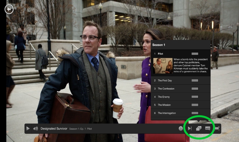
Netflix, on the other hand, has been consistent with the order. Their website arranges the episodes from left to right (regardless of their genre) and on Apple TV the order is top to bottom.

nf-04

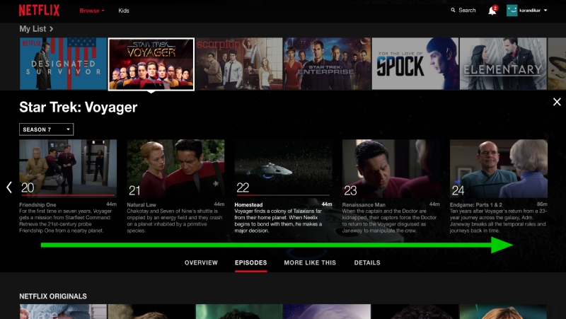
They also show me a little progress indicator on the episodes. That’s helpful.

nf-01

Here I have to jump back to the episodes screen, but on their mobile app the episodes get stacked neatly in the progress bar making it easier on my thumb. (Hotstar on web does provide similar ease as the episodes get listed below the player window).

nf-03

I am not suggesting that Hostar should follow Netflix. What it should follow is the way in which Netflix cared about user orientation and user needs while designing their screens.

There are a few other things that Hotstar can do to improve, such as truly remembering the show that I am watching – not just let the show appear in the list where the user HAS to click to continue watching – and not throw a “Start Watching” button when I visit the Show page by any other mean. Or making sure I can pinpoint the location on the video timeline their Apple TV app (currently it just jumps ahead by a few minutes).

hs-01ahs-02a

hs-05

But I understand that these are technical glitches and they will be fixed sooner or later. What truly needs fixing, and this is not a suggestion exclusively to Hotstar, is to be cognisant of user expectations.

If the user has learnt to interact in a particular way, it pays not to surprise the user by providing a totally different design. We must not surprise the user at the expense of usability. Our goal must be ‘user delight’, and that begins with familiarity. No two apps should be blatant copies of each other, but user’s mental model’s should not be discarded in the quest to be different.

Domino’s & WhatsApp. Don’t you recognise your own users?


2-logos

Well, there’s nothing that connects these apps except for the fact that they both fail to use some obvious data-driven intelligence and I got to experience both of them at around the same time.

When expect online services to know about us. In an age where we willingly give out personal data to such apps regardless of the vulnerability of our online identities, we at lest expect them to use those details to deliver a satisfactory user experience.

The Dominos Pizza ordering app asks the users to submit information that they already have, whereas WhatsApp demonstrates that they do not know their own users. In case of Dominos, I ended up closing the app and dialling their local number instead, WhatsApp merely brought a smile on my face. No harm done. But guys, come on!

While having a business conversation my prospective client and I exchanged our cell numbers and he immediately sent me his contact card via WhatsApp. The message looked like this:

IMG_0684

What amused me was that this person had sent me his own contact card. That, too, on WhatsApp, yet WhatsApp asked me to invite the same person to the network! Amusing.

Agreed that had my client sent me just a plain ‘hi’ and not a contact card, this perhaps wouldn’t have happened, but wouldn’t it be possible for WhatsApp to realise that the user is sending his/her own information and there’s no point asking the recipient to invite the same user? While there may be technical / legal reasons for this to be an issue, to an observer this feels less than ideal.

But there would be no technical justification for the Domino’s experience. We all know that we willingly share our mobile numbers and associate a delivery address with the number. Every conversation that I have ever had with Domino’s began with “Sir, What’s your contact number?”. Yet when I downloaded the mobile app and tried ordering through it, I was asked to repeat myself.

During the registration process I was to give out my mobile number. then a 4 digit PIN was sent to my mobile and I had to confirm it. So far so good. The next step looked like this:

IMG_0693

Although I understand that this was an indication that I had not saved any addresses on this app and on this device, I had, already given at least one address to Domino’s, as an organisation!

When I call Domino’s , all I have to give is my mobile number. I never have to repeat my address. (I may have to confirm it, as I may want the delivery to come to a different address). Since I selected my City and then my Locality/Area, I imagine that the database from which Domino’s had to obtain my address would be smaller and hence, the operation easier. Yet I had to provide my address as if I was doing it for the first time!

I did what any self-respecting hungry person would do: I just closed the app, picked up the phone and made a call!

We are moving to a world where user identification would be a norm. Scary as it may seem to online privacy advocates*, there is a large population that does not mind it, but they would surely demand a more personalised experience.

——

*Cybersafety suggestions to such online services:
1] Even if you find a way to display the users address, don’t show it completely.
2] Don’t take a user’s request to change the address unless the user provides the old address and it matches the one on your record.


Logitech Keyboard K480: These instructions would self-destruct in…

Do you keep the stickers on your television set? The ones that are best suited to tell customers about the features in a shop environment? I promptly remove them, but I have found out that I am in the minority! Most people tend to get used to instructional text, illustrations and stickers on appliances. Once you have understood how the device works, or what all features are there, they tend to visually ignore such instructional graphics.

It is argued that the human brain sees everything. Listeners to every noise. Registered every smell and touch. We just filter out what’s not necessary, but the brain has to do all the work nevertheless. That’s the reason why many good designers tend to remove ‘visual load’ from their designs. Choosing simplicity versus complexity.

Exhibit A: The instructional stickers on the Logitech Bluetooth Keyboard K480.

This handy device connects to up to 3 devices simultaneously. Not something that we use everyday. Therefore some amount of user education had to happen before the first use. There were some five steps illustrated on a black sticker – the kind that users generally tend to keep on.

But unlike most devices, this one also had a small flap that one can pull and remove the sticker. Evidence that the designer wanted the user to remove the sticker and visual load that it brought with it. The instructions were necessary to initiate the use but unnecessary for continual use.


For the record I have made an exception and have kept the sticker on. In respect to the designer who was kind enough to provide the sticker-flap. 

My Burger King: Daunting Task of Responding to Surveys

whopper1

I like taking surveys. I like taking survey that tell me in advance how much time they will take away from my limited existence on this planet. I take them even if they don’t offer some goodies or discounts. Why? because I like to help people give me better service text time. But sometimes horse falls at the first fence.

Last evening I went to Burger king outlet in Phoenix Mills, Parel (Mumbai, India) with my daughter. I wanted her to eat a real burger and not ask for some stupid toys. And were we model customers! We ate our burgers in peace and generally kept the table clean. Just then an attractive young girl in official looking attire walks upto me and smilingly requests me to fill out a survey. The carrot? A whopping 10% discount on my next order!

Here are the things that I, as a respondent, was supposed to do:

1] Go to the burger king website on my mobile device.This means I was to use my mobile device and mobile data. I would have appreciated if they just handed over a paper and pen. Perhaps an iPad, the way some of the restaurants have started doing nowadays.

2] Tap on the continue button so that the real survey starts. Hmm. Did I gave up my inheritance to them by clicking on that button? Don’t know. The text was too small to read.

3] Input a small number on my receipt. The number was difficult to read, so she offered to dictate that to me. Not type it herself. And I got to know why very soon.

IMG_8648

Each of these text boxes took only 3 digits (except for the last one which took only 2). But every time I typed fourth digit, the field won’t take it! I had to MANUALLY tap on the next field and start typing. I was supposed to do this type+tapping 6 times. Just to start the survey. Now I know this can be easily done in markup. Credit card forms do this all the time.

Well I didn’t want to disappoint the girl, who incidentally, was just doing her job. So I did all that

4] Now I had to start answering the questions and that’s when I gave up. You can see here why –

IMG_8647

Huh! I was sitting there, that means I was dining-in! What kind of stupid question was that??? But let it be. How was a poor web app to know? What scared me most was the ‘percentage completed’ text. It said that this question is just 1% of the survey!

This meant that I had to devote about 20-30 minutes of my time on this while all my daughter wanted me to do was to get out and follow her to Hamley’s where I would be spending much more money than I did here. Perhaps it was this prospect that made me give up! But I looked down at the screen again and was convinced that it was the 1% that scared me the most.

Long story short, I may love their burgers, but their survey sure needs some work.

J W Marriot, Pune: Washbasin Etiquette.

At HFI, one of our instructors had said jokingly, “With your training in User Experience, you can make a shoe better. Just that you may not use your training for fixing one”! Indeed thinking about User Experience is essential component in a brand’s make up. Even if the brand is not an app or a website, but is in hospitality. Every interaction that the customers have with the brand need to be carefully controlled.

A few days back I was at the J W Marriott in Pune, Maharashtra India. After a nice lunch at one of their restaurants I headed for the washroom. Here is what I saw at the washbasin-

taps

Any modern washroom is likely to have a touch-free faucet, and indeed this one was no different. But they had to say so on the top of the knob! Why?

Inspite of visible and quite in-your-face typography, I could see some fingerprints on the knob. Evidently, many of the patrons did touch / press / tap on the flat top of the knob and expected the water to flow. While all you had to do was to hold your hands under it and let the infra-red sensor do the trick.

This raised a few questions –

1] Why were the patrons touching the knob inspite of the warning?

2] Were they unable to read english? (in case of asian or non-english speaking patrons, this could’ve been the case.

3] Why did they have to print the warning there? I had encountered automatic, touch-free faucets before but I don’t recall reading such message anywhere else.

My guess was simply this: The design of the tap was wrong. The tall column and the flat top was inviting the user to operate it. It looked too much like the one that needs a press. The design was simply giving a wrong affordance cue (an affordance cue is an indication that a specific action has to be taken by the user, such as a button that prompts clicking or a slider switch that prompts swiping on interfaces).

If you are designing a water tap that needs no operating, design it in such a way that it gives the right affordance cue, e.g. no hint of operating mechanism on top of the water tap. What should worry J W Marriott is that they have chosen a design that may create a less than perfect User Experience. Even a water faucet counts when you are working towards ‘User / Customer Delight’

TOI (Times of India) Mobile App: Carrots and Sticks

Have you ever seen an ad incentivising the download of WhatsApp? Or Facebook app? Of course you haven’t. The app provides enough carrots as it is. The product is the promotion itself. But when I spotted the following ad in today’s Economic Times (a TOI group publication) I felt sorry for the app designers, developers, the marketing advisors and the advertising agency all at once. Er… lets add the client to the list as well.

FullSizeRender

The logic here is that if a user has chanced upon the TOI app (which is a newspaper app) and decided not to download it, a ₹50 mobile recharge would change her mind. Another version of the logic is that If the user has not heard about the TOI app yet, here is the bloody ad, now go download it!

If you haven’t noticed, Paytm also gets to see your valid Facebook credentials in the process. Hmm. No free lunch after all!

I have a few questions here. If I, as a user, did not hear about the app until now (years after its launch) was I living under a rock? or did nobody see it fit to recommend it to me yet? Was the app providing no special experience to its users so that they talk about it? And more importantly would people, who want ₹50 mobile recharge to download the app, actually use it?

Ok, let’s be fair and say that the small carrot will at least make the user download and open the app once. The number of downloads would go up momentarily and the marketing advisor and the ad agency would throw a small party in the cafeteria. But would the app deliver an experience that would turn the users into proponents? Would the experience make people talk about the good things designed inside the app? Its future-readiness? Its advantages over the printed version?

Agreed that TOI was the first Indian publication to have a mobile app (historians, please correct me if I am wrong). But to maintain the edge, they need to use sticks upon their UX designers and not such carrots. Build a great user experience that will make people use nothing else as their primary source of news.

Note: Frankly speaking, the author had downloaded the TOI app long back and is currently carrying out a frantic search for it on his handset. Perhaps it was the old phone.

iPhone 6 : More Than a Handful

God always intended the mobile phone to be used with just one hand. Atheists, agnostics and Dawkinians may wish to replace the first word with ‘natural selection’ ‘higher power’ or ‘watchmaker’, as required. I would like to replace it with ‘Steve’.

Indeed, Steve did so. iPhone designs up to 4S did agree with the average grip of a human hand. One of them, to be precise. Since his departure from this world, his beloved company seems to be bowing down to commercial pressures of coming up with ‘bigger’ phones.

iPhone 5S topped up one row of app icons. Although they were hard to tap with one (average sized human) thumb, the new size displayed 16:9 videos pretty well, and everybody was supposed to keep quiet since it was the best iPhone ever (as ever), moreover, the width of the phone was still the same! So why are you complaining, huh?

But with iPhone 6 and 6+ things have literally gone out of one hand. Although 6 can still be called ‘a phone’, 6+ is clearly a case of wrong branding. How about calling it iPad ‘Nano’? The app icons turn 90 degrees when you turn the device, just like all iPads!

But I digress. We were speaking about ‘phones’.

Since I’ve started using 6, my index finger must have reached the top of the phone at least 100 times only to realise that the power button is no longer there! Now it is on the right side. With a bevelled edge that can let the phone slip out of your hand, and the new placement for power button, the phone looks like any other phone sporting a droid.

Power-Shift

Not that the product designers don’t realise this. That is why we see many attempts at reconciling with ergonomics. A few Android applications have introduced ‘single hand mode’ like in the case of the calculator app shown below. But I can understand the challenges of ever growing device dimensions that Android app designers face.

Screenshot_2014-10-31-11-23-27


Thanks to the new ‘heights’ Apple devices have reached, iOS app designers now have challenges of their own. And their own UI designers have shown the way-When you tap twice, ever so gently, on the home button, the icons descend down to reach your puny little thumb! I can almost hear Tim going, “Best workaround ever”!

IMG_5204

But should we pat ourselves on the back? Is there any glory in overcoming obstacles that we place upon ourselves? Maybe one day, according to the Darwinian theory of survival, we may grow bigger palms. Pigs could fly. And Apple may go back to producing 4S.

Sigh! What a lovely machine! And so apt for our anatomy!

Update: March 21, 2016

Today Apple launched iPhone SE – It is As small as an iPhone 5S. Leaving their obsession with large phones, Apple seem now to be finding their way back to ergonomic realities.

Godspeed…


iOS 8 Spotlight Search: A Simple Yet Helpful Tweak

Sometime, amidst the frenzy of new arrivals of features and capabilities, simple things go unnoticed. No matter how small, every design decision to make life easy for the user must be applauded. Case in point: Visual treatment tweak to Spotlight Search on iOS8.

Once upon a time, when Steve was alive, iOS made sure that the user is taken to a different screen to perform search for apps and other data on the device (as well as on the internet if the device is connected). The reason – To let the user focus on the task at hand and not be disturbed visually.

photo1-6

There was one problem, though. The user had to scroll away from the current screen. And if the screen was 5th or 6th on right, the user had to either scroll frantically to go to the search screen on left, or press home button and swipe left.

iOS 7 corrected this, making Spotlight search available on every screen. All the user had to do was to swipe top-down and the search bar was there!

IMG_4951

What got forgotten was the focus earlier design provided. As the search bar appeared, the chaos of app icons stayed on, adding a few moments for the eye to travel to the search bar.

Now, in iOS 8, this has been corrected. The whole screen gets blurred so that the user can focus on the task at hand.

IMG_4950

This may seem trivial, but not to the UX team at Apple. Someone over there is fighting out these small issues. You may call it going back to what worked, or realising your mistake, or an internal argument getting settled with actual product usage test. However achieved, this design tweak will add up perhaps a milligram of user satisfaction. Yet we must agree that every bit helps to achieve a great user experience.

Foursquare: Turn On Turn Off

There are times when I get fed up with my always-on online presence. Facebooks of the world have made it difficult for their users to log off by hiding that menu option under something called ‘Account’ or ‘Settings’. I hear them sing, “You can check out any time you like, but you can never leave!”

Yet one of the joys of having a mobile device is to be able to turn off location services every now and then. Go underground, become invisible to the prying eyes of my foursquare friends. Go missing!

But when my pangs of solitude get subsided, I invariably come back to civilisation by the means of Foursquare. All eager to know who is eating what, at which restaurant. Who is shopping where, with whom, etc.

As a user I want the app to submit to my wishes, not take orders from it. But see what treatment I got:

Situation – I launch Foursquare app.
Condition – my locations services are turned off.
I see this:

photo1-3

Well, I don’t wish to click that close button. I do wish Foursquare to ‘turn the location services on’ as the question suggests.
So I tap on the pink band. And what do I see?

photo2

Ah! A lesson in how to use my phone! Perhaps handy for the first time iPhone users, but I’ve been playing with this toy for over a year, thank you very much!

With a little irritation I press ‘Got it’. Because I really did. And I discover that I just closed a pop-up box, but no action is taken:

photo3

So I am missing out on amazing recommendations and tips sent directly to me! Boy, wasn’t that the reason I took this course of action? So I tap ‘Turn on your Location services’ only to see that pop-up I just closed. No action!

Before I compose a post criticising Foursquare, it was only fair that I check what other apps do. Google Maps simply told me that my Location services were disabled. No Action. No tutorials either (thankfully)!

photo4

Among all the apps only Instagram did what I expected it to do. It realised my Location services were disabled, and simply showed me a dialogue box, where all I had to do was to tap on ‘Settings’, and I was taken to the Location services settings screen!

photo5

In two taps, I was back in business! Back to life!

All above mentioned ape are successful in their own right. But the one that thinks carefully about user experience gets my vote of approval. The key is to care about user expectations, draw as many scenarios as possible before settling on the final interaction design of the application.

In this regard, Instagram wins hands down. Foursquare, are you taking notes?

Linkedin: Never never repeat repeat yourself yourself

Yes, I live in a place that has spotty network. This somehow makes me an ideal user testing candidate, because if you can help me, you can help all your users.

Here is what happens to most of my social postings: I make a post. I hit the submit / post button. And wait. Nothing much happens… My post is yet not there in the public eye. Or so I gather from the page that has long stopped refreshing itself. I have tweeted a tweet twice, I have pinned a pin twice. I have even posted the same thing on Facebook twice. Once I realise my mistake I scramble to look less like an idiot and delete the repeated post! Maybe I am too paranoid about my posting as if millions are watching my every move. Well, this false sense of fame is a direct byproduct of social media!

But one such network is worried about their users reputation (understandably, since it’s their business) and that is LinkedIn!

I just posted something on Linkedin, and I wasn’t sure if I had really done that (again I have my network to thank). So I composed the entire post again (along with the appropriate link that I had to share. But something interesting happened! Take a look:

Screen Shot 2014-01-05 at 8.39.17 am

Don’t you love when such error messages start with “We are unable to…” as opposed to “You goofed up there, buddy!”

All it took for them to realise that I was repeating myself was the content of my post that matched exactly with a post that was made last! How hard is it technically? But to think about introducing this kind of error message is not commonplace. It goes to show that nothing is more important to Linked than stopping me from looking like an idiot and I thank them for that!

PS: As one of my observant friends pointed out, even twitter sports a similar functionality, but uses a more folksy language (Opps! You already tweeted that). Whereas G+ and Facebook couldn’t care less.